

Inquiry
Form loading...
conatctz48
contact US

10 Tips to Improve Sketch Up Renders?

Great Sketch Up Renders do more than show a finished model. They help viewers understand scale, materials, and the feeling of a space. But polished images rarely come from one dramatic effect. They depend on small, deliberate choices: a camera set near eye level, soft daylight across a timber floor, and shadows that reveal depth without hiding detail. This guide explores ten practical ways to improve your Sketch Up Renders, from cleaner geometry and balanced lighting to thoughtful composition and careful post-processing.

SketchUp author and educator Alex Schreyer is known for practical guidance on modeling and visualization. A useful summary of that approach, paraphrased rather than quoted verbatim, is: “Build a clear model, then make every visual choice serve the design.” It is a simple standard. It also takes restraint. A glossy material can look convincing in a sample and distracting across an entire room. More detail is not always better.

The tips ahead focus on choices you can test in a real scene: soften a harsh window highlight, add subtle texture to a broad wall, or move a chair that blocks the focal point. Small changes matter. I still find it easy to over-light a scene and flatten its shadows. That is worth checking before export. A render should feel inviting, but it should also remain honest to the model and its materials.
10 Tips to Improve Sketch Up Renders?

Understand SketchUp’s Rendering Workflow and Settings

Tip: Treat rendering as a workflow, not a final button. Start with clean geometry, named materials, and a saved camera view. Then set the render engine, image dimensions, sampling quality, and lighting before testing. Use a small preview to catch clipped highlights or muddy corners; increase quality only after composition and exposure feel right. Small changes matter.

Tip: Match lighting to the scene. Set the time of day, sun angle, and sky brightness before adding interior lights. The U.S. Department of Energy estimates that lighting accounts for about 15% of electricity use in an average American home. That is real-world energy data, not a rendering benchmark, but it reminds us that lighting strongly shapes how a room reads. A render can look polished and still feel wrong if every surface is equally bright.

Tip: Save a low-resolution test, inspect it at full size, then refine shadows, reflections, and material scale. Keep glass subtle; overly sharp reflections can make a window look like a mirror. One useful check is to compare the render with the viewport and note what changed. I sometimes push contrast too far while chasing drama. It is worth stepping back, though the softer version may seem less impressive at first.
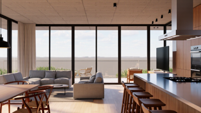
10 Tips to Improve SketchUp Renders: Choose Your Output Resolution

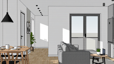
Start with a 1280 × 720 preview while refining materials, lighting, and camera settings. Move to 1920 × 1080 for a standard Full HD output, and use 3840 × 2160 when you need 4K detail. Higher resolutions contain more pixels and can take longer to render, depending on your rendering software and settings.

Prepare Models with Accurate Geometry and Materials

A convincing render starts with geometry that matches the intended object. Check key dimensions before adding detail, especially around doors, counters, and window openings. Small errors can create visible gaps or strange shadows. Keep edges aligned, remove duplicate faces, and inspect the model from several angles. A surface that looks flat in one view may hide a misaligned edge elsewhere. I still sometimes overlook tiny overlaps; a quick section view helps catch them.

Tip: Build complex forms from simple shapes, then check their intersections. Use consistent face orientation and avoid adding detail that the camera will never show. Save a clean copy before making large edits.

Materials should support the geometry, not disguise it. Assign them by surface, and use restrained differences in color, gloss, and texture. For example, a matte painted wall should not reflect light like polished stone. Test materials under the same lighting planned for the final image. Scale matters, too: oversized wood grain can make a full-size cabinet look like a miniature. I find it useful to compare a material sample against a familiar real object, though that judgment is not always exact. Revisit any surface that looks convincing only from one angle.

Optimize Lighting, Shadows, and Camera Composition

10 Tips to Improve SketchUp Renders?

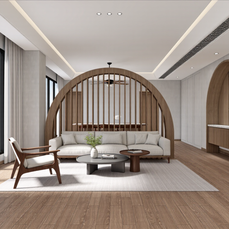
Lighting and shadows shape how a room feels before viewers notice its details. Start with a clear light source, such as a window on the left, and check where its shadows fall. If every corner looks equally bright, the scene may feel flat. Add gentle fill light only where important surfaces disappear into darkness. Keep an eye on pale walls; they can lose texture when overexposed. Small adjustments matter.

Set the sun angle to create readable shadows, not dramatic stripes across every surface. A low angle can reveal floor texture and wall depth, but it may also stretch shadows awkwardly. Test a few times of day. I still get this wrong. A quick preview often exposes problems that are easy to miss while modeling.

Camera composition deserves the same care as lighting. Place the camera near eye level for a natural interior view, then adjust it to avoid tilted vertical edges. Use a doorway, table edge, or window frame to guide the viewer’s eye. Leave breathing room around key furniture instead of cropping it tightly. Try a second camera position before settling; the first attractive angle may hide a cramped layout. Keep perspective believable, and review the image at its intended display size.

Refine Render Quality with Post-Processing

Refine render quality with post-processing by correcting what the model cannot fully control. Start with exposure and white balance: keep window highlights from turning white, and preserve the warm tone of oak or brick. Add contact shadows beneath chairs and along wall corners, but avoid dark halos. A 2023 Digital Construction Report found that 73% of surveyed construction professionals used BIM. That figure describes workflow adoption, not render quality, but it highlights how visual output sits within a broader digital process.

Use subtle adjustments. A faint atmospheric haze can separate a distant tree line from the building, while a restrained sharpening pass can clarify window frames. Check the image at full size and as a small thumbnail; an effect that looks elegant up close may become muddy when reduced. I still sometimes push contrast too far. Pulling it back often restores detail in dark interiors and bright skies. Keep an untouched export beside each edited version, so changes remain easy to compare. Small edits matter. Reflections can also be softened selectively, especially on glass near a bright sky, where hard contrast may distract from the architecture.

10 Tips to Improve Sketch Up Renders? - Refine Render Quality with Post-Processing

# Post-Processing Tip What to Adjust Practical Starting Point Why It Helps
1 Balance exposure Adjust overall brightness while checking both bright windows and shadowed areas. Make small exposure changes, around 0.1–0.3 EV at a time. Preserves visible detail and gives the image a more even tonal range.
2 Correct white balance Use neutral surfaces, such as white walls or gray paving, as visual references. Move temperature and tint gradually until neutral materials look neutral. Reduces unwanted color casts from lighting or the original render settings.
3 Recover highlights and shadows Lower overly bright areas and lift dark regions without flattening the whole image. Begin with modest adjustments; avoid pushing either control to its limit. Helps retain detail in windows, light walls, shaded corners, and furniture.
4 Refine contrast with a tone curve Make restrained adjustments to the midtones while protecting highlights and dark tones. Use a gentle curve rather than a strong S-shaped curve. Adds depth and separation while keeping architectural surfaces believable.
5 Control saturation Adjust overall saturation, then check strong colors such as plants, upholstery, and accent walls. Reduce saturation slightly if colors appear unusually vivid. Keeps materials natural and prevents color from distracting from the design.
6 Fine-tune color balance Adjust color in shadows, midtones, and highlights separately when the image has mixed lighting. Make subtle changes and compare against neutral materials in the scene. Can make interior and exterior lighting feel more consistent.
7 Reduce noise carefully Apply noise reduction to grain in flat areas and dark regions. Use only enough to reduce visible noise; inspect edges and fine textures afterward. Creates smoother surfaces without removing important material detail.
8 Sharpen after resizing Apply output sharpening once the image has been resized for its final use. Use a low-to-moderate amount and check fine edges at actual display size. Restores perceived crispness while reducing halos around windows and furniture.
9 Correct perspective cautiously Use perspective correction only when vertical lines visibly converge unintentionally. Make small corrections and check that the building’s proportions remain credible. Improves presentation while avoiding distorted rooms or façades.
10 Check the final export Review image dimensions, color appearance, compression, and details at 100% zoom. Export at the required pixel dimensions and use a suitable image format for the destination. Helps ensure the finished image looks consistent across screens and in presentations.

Review and Adjust the Final Image for Clarity and Realism

Review the final SketchUp image at full size and as a thumbnail. At full size, inspect edges, shadows, reflections, and texture scale. At thumbnail size, check whether the room’s main subject remains obvious. Tiny visual noise can vanish on screen, then distract in print. Keep it restrained.

Tips: Compare the render with your reference photos under similar lighting. Correct over-bright windows, muddy corners, and reflections that reveal nothing nearby. Check that wood grain and tile sizes feel believable beside familiar objects, such as a chair or door handle. Save a draft before making broad color adjustments; small edits can shift the whole mood.

The 2023 Profile of Home Staging reported that 81% of buyers’ agents said staging helped buyers visualize a property as a future home. This measures staging, not rendered images, but it highlights how visual cues support understanding. Make focal details clear without adding decoration everywhere.

I sometimes find a polished image still feels strangely sterile. A slightly uneven cushion or softened shadow may help, but too much imperfection can look accidental. Recheck the image on another display before delivery.

Name(required)

Message(required)

VISIT US

GuangZhou

Room 2301, building A, poly zhongyu plaza, no. 626 tianhe north road, guangzhou, China

Phone/WhatsApp

+86 13392497798

Email

lights@chinarendering.com